Let us start with two questions statisticians, data producers and analysts might face: With hundreds, thousands, or even millions of rows of data stored in my data warehouse, how do I effectively tell a story using that data? How can I help my users identify and understand patterns in this massive amount of information to support crucial evidence-based decisions?
The total amount of data created, captured, copied, and consumed globally is estimated at around 64.2 zettabytes in 2020, almost doubling every two years. As the data deluge continues to grow, with more data sources, new technologies, and changing user habits, statistical organisations have recognised the need to adapt from primarily publishers of official statistics to storytellers. Taking on this new role and the associated challenges brings with it an increasing need to visualise their data in new ways. This brings us back to the previous questions and poses a new one: which technical solution delivers the best understanding of these massive and growing datasets, allowing us to identify patterns and draw out key stories?
Power BI and SDMX: Empowering users to discover insights in numbers
Data visualisation is a powerful tool to find the story in the data and communicate that story to others – a picture might be worth a thousand words, but a good Dataviz is worth more! Microsoft Power BI is one tool statisticians are using to create and publish rich visualisations.
However, with these available tools, a challenge remains: How do you find and access the multiplicity of sources of official statistics from around the globe? Here is where Statistical Data and Metadata eXchange (SDMX) comes into play. An international open standard, it is used as lingua franca by more and more statistical organisations to effectively produce and disseminate official statistics. They are made available through a standard Application Programming Interface (API), a set of rules that define how computers or applications communicate with one another. The OECD-led Statistical Information System Collaboration Community (SIS-CC), a leading open source community in the field of official statistics is using SDMX as its standard interface for data sourcing and data visualisation and has now enhanced its functionalities by connecting to Power BI.
Combining Power BI and SDMX brings a vast audience closer to official statistics
The SIS-CC SDMX Power BI connector brings these technologies together, enabling the easy creation of Power BI reports from SDMX data sources. This Power BI connector has been developed open source, freely available by the SIS-CC. The connector has now been officially certified by Microsoft, allowing users of official statistics worldwide to easily connect, shape, visualise, and share data insights through Power BI.
The SIS-CC SDMX Power BI connector is another smart way of interconnecting ecosystems, that is the Power BI user base and producers of official statistics, as a way to produce value out of data. We foresee that the semantic power of SDMX will continue to contribute greatly to accessibility of official statistics, in ways similar to the SIS-CC SDMX Power BI connector”. Eric Anvar, Head of Smart Data at the OECD
A Use Case of SDMX in Power BI: Tracking Trade Flows in Pacific Island Countries
The Pacific Community, one of the 15 members of the SIS-CC, is increasingly using Power BI to visualise content from the Pacific Data Hub (PDH.Stat) database.
PHD.Stat, the flagship component of the Pacific Data Hub (SDMX-powered .Stat Suite software), is used for publishing regional statistics as structured datasets, providing major opportunities for optimising the dissemination and accessibility of Pacific statistics through a wide range of channels including MS Power BI.
A good example of this is the recently created International Merchandise Trade Statistics dashboard.
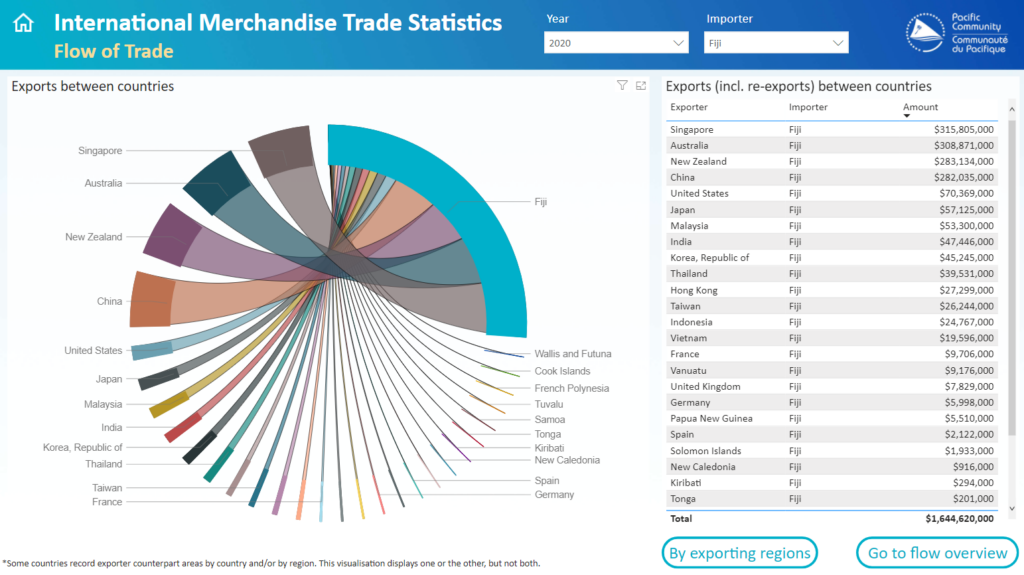
To create a dashboard such as this one, a user accesses the desired PDH.Stat dataset via the Power BI-SDMX Connector, transforms and formats the data, and then hooks it up to any number of the wide array of visualisations which Power BI has on offer.
This whole process is significantly streamlined with the Power BI-SDMX Connector reducing the import and data transformation process to less than 10% of the steps required when using a custom script. Novice users can now more easily add, transform and format data without full knowledge of the underlying structure of the data.
It’s amazing to see how quickly a valuable decision-support dashboard like this could be put together through Power BI. Phil Bright, GIS, Innovation and Dissemination Lead from the Pacific Community Statistics for Development Division.
The power to connect statistics, narratives and visualisations
The list of users already reaping the benefits of the new connector is long. For instance, it is becoming easier and faster to access large amounts of official data on recorded COVID-19 cases or vaccinations and to build interactive monitoring dashboards. Data providers are now well equipped to provide easy-to-understand, regularly and automatically updated data and dashboards.
These dashboards go beyond the reporting of numbers, allowing for detailed analyses tailored to users’ needs and for enhanced storytelling and sharing. Iulian Pogor, Data Architect and Statistical Tools Engineer at the International Labour Organisation, highlighted their use in telling compelling data stories, shedding light on the pandemic’s impact on the labour market, including unemployment, working conditions and unpaid work:
We can easily embed the visualisations on any website where the media and general public can interact with them and even print, download or share them in social networks. Iulian Pogor, Data Architect and Statistical Tools Engineer at the International Labour Organisation
Coming back to the opening question, we still have the same wealth of data. But we also have solutions to ensure that the data is available to the right people, at the right time, in the right way. This includes policymakers, who need to make informed decisions, and policy shapers, notably the media, who structure and influence the public discourse. To sum up, statistical organisations can enable such data-driven conversations by providing better access, narratives and ways of sharing official statistics through the use of technologies such as Power BI.
Resource list
- Webinar recording: SDMX Power BI Connector launch
- Example on trade statistics: Power BI Dashboard
- Getting started I: Documentation page
- Getting started II: How to video
- How to contribute: Gitlab project site
Acknowledgement
We would like to thank the following people for their contributions: David Barraclough, Smart Data Practices Manager at the OECD, for overseeing the implementation and certification process; Ruth Pozuelo Martinez, business owner of Curbal for collaboration and support on this project and certification with Microsoft; Phil Bright, GIS, Innovation and Dissemination Lead, Statistics for Development Division, SPC for contributing to the article with the use case and supporting the implementation through user testing; and Iulian Pogor, Data Architect & Statistical Tools Engineer, at the ILO for contributing to the testing of the connector.
The article was published in the December issue of the OECD Statistics Newsletter.